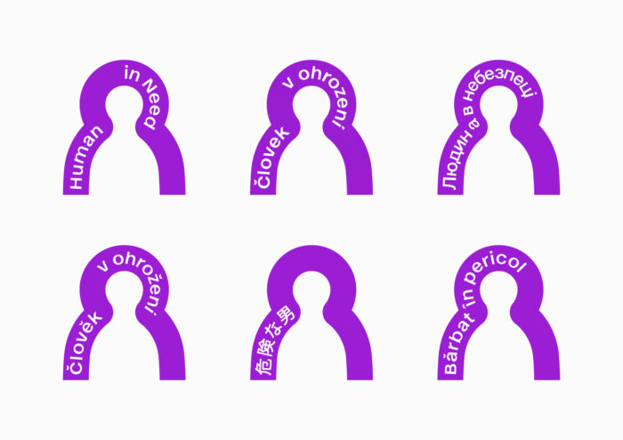
New logo of People in Peril
After a large increase in the capacity of People in Peril, we are changing our affiliation with the Czech organisation People in Need and continuing our work under a separate brand. Our logo and visual identity will also change. In this article we will introduce you how.
In the last two years since the outbreak of the war in Ukraine, our team has grown to more than 200. During this period we have expanded our presence in Slovakia from 7 locations to 17, we have registered an office in Ukraine and we have a permanent team in the country that is currently assisting. Thanks to all these changes, we have been able to help more than 235,000 people in Slovakia and around the world and deliver more than 4,000 tonnes of material aid to Ukraine.
We have also changed our internal workings and introduced systems that have made our day-to-day work more efficient. This has taken us to the next stage of our development and we have the ambition to become one of Europe’s humanitarian organisations. That is why we have agreed with our Czech partner organisation, People in Need, that from the new year 2024 we will operate under a separate brand and with looser interconnection. This move allows us to respond more quickly and flexibly to sudden-onset disasters and to ensure that our work is recognisable to both aid recipients and donors.
The move required, among other things, a change of logo and visual identity. We entrusted the creation of our logo and visual identity into the hands of skilled designers from the studio Andrej&Andrej.
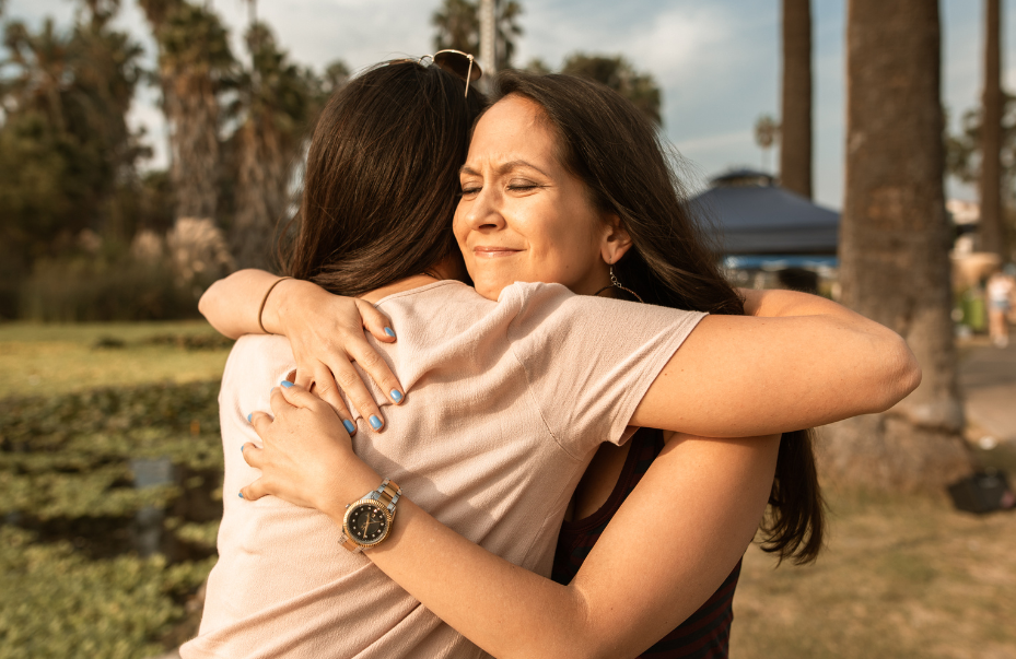
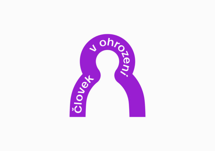
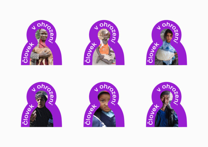
Before the logo was given its current form, it went through a longer development and several shape and colour alternatives. Its final form depicts everything that characterises our organisation. People in Peril is an organisation that is ideologically represented by working with people, providing protection and support to people in need. We believe that our new logo is also like that.
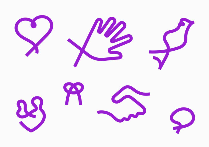
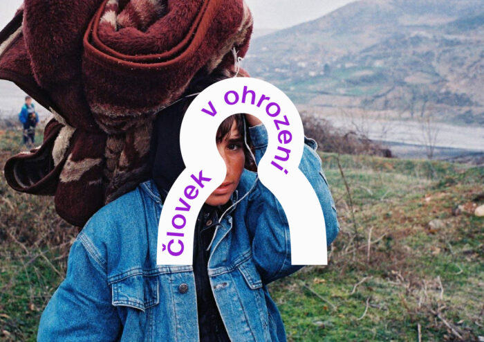
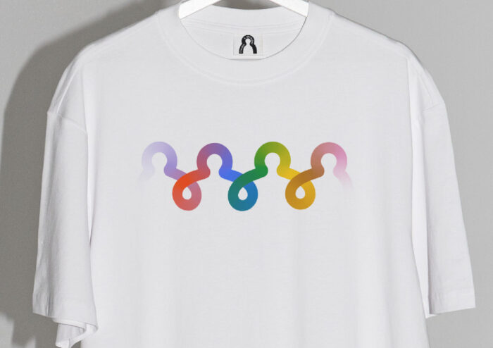
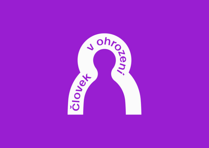
The logo represents the symbolic protection of a person, creating a shield and a sense of security around him. It works with a graphic line that represents the ribbon as a direct link between the person who helps and the one who receives the help or support. The ribbon passing around the symbolic figure of the person is both their protection and their connection to the world around them.
We are also changing the colour scheme – we are changing the blue to a bold purple, which makes our logo very distinct from previous ones we have used as an organisation. At the same time, this colour is also different from other NGOs and humanitarian organisations at home and around the world. The distinctive purple colour is easy to read and see even in the field, it is easily identifiable and memorable.
A new visual journey awaits us that will open up our communication more towards the people, be easy and clear for them to read and bring a sense of safety and care into their lives.